Official website link: https://www.deviantart.com/
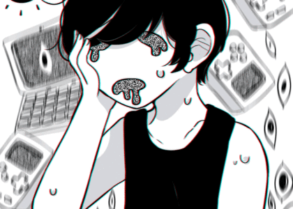
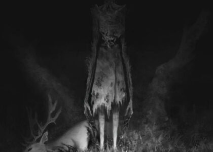
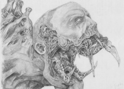
I decided to give a review on the website called DeviantArt. When I post about art related to my blogs I always go on Deviant Art to find artists that create cool art based the entertainment I choose to write about in the horror and fiction genres. Deviant Art has existed since the 2000’s and was used an online social network for artists and art enthusiasts to promote and share are within the art community (DeviantArt, (n.a.)). The online social platform has improved a lot since the 2000s. However, after learning about design elements in Mauve Pagé’s best practices, I decided that DeviantArt’s website could have better visibility and improvement.
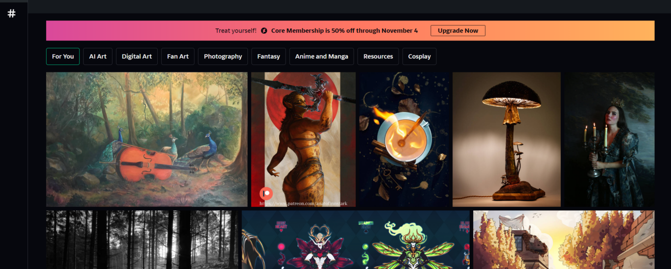
I decided to analyze the home page of DeviantArt. The website has changed a lot since the 2000s. New users are greeted with some art on the home page to scroll through, usually with featured art that was published recently and related to your previous search history on the website. However, the site is very underwhelming. We are greeted mostly with photos and little text. Until you actually click on a piece of art, you get to see users’ comments and information related to the art posted by the artist. If the website was structured to be a social network, we would have more posts on the home page rather than multiple photos of art. The website can be treated the same as a Google search engine. For example, if I wanted to find images for a project, I would just search up an image on Google images.
The header/menu of the website features a search bar, a home page button, a shop button, a join button, login button, and profile button and a submit+ button that all have drop-down menus, which allow for easy and simple navigation for users navigating the website. The colour themes of neon green and black on the website are featured throughout the pages, which make it very easy on the eyes and allows for art posts to stand out more because of the black background of the website.
Overall, the website could have room for improvement by improving their home page to feature artists, because the website is technically a social media network. I suggest having a featured artist of the week to increase visibility of artists that actually use the website that also uploads their art consistently.
DeviantArt. (n.a.). About DeviantArt. https://www.deviantart.com/about